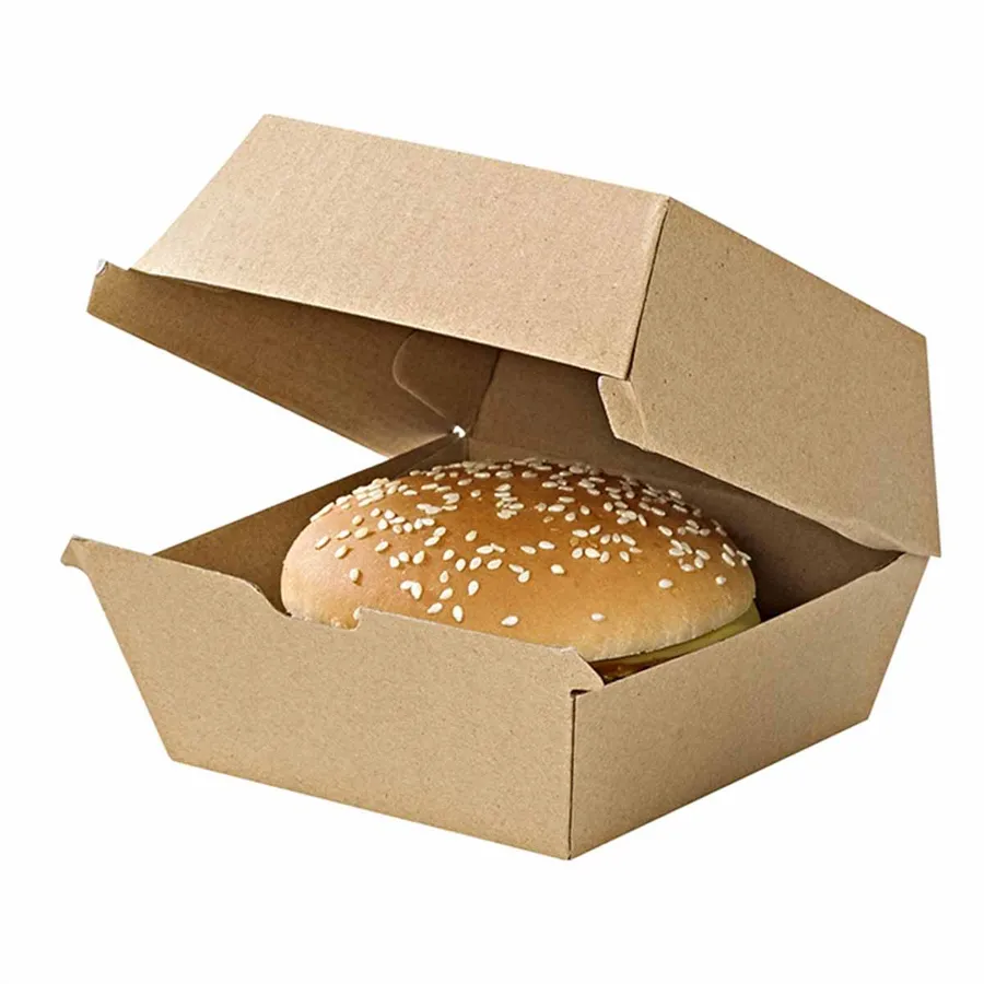
Packaging guide
Kraft or White Board for Food Packaging: Print, Grease and Cost Compared
How print, grease marks and the quote differ between kraft and white board, with four combinations compared.
What is the difference between kraft and white board?
Kraft board is brown because it is left in the colour of the pulp. White board has a bleached or coated top layer that gives a bright, smooth surface for print. Underneath, both are the same folding board or corrugated sheet.
That one difference, the colour of the surface, changes how ink looks, how grease shows and what the finished box says about your food. It does not change how the box folds, how strong it is or how it handles heat.
There is a third option: kraft board with a white layer on one face, or white board printed to look like kraft. Both exist, and both are worth a question on the quote if you want the look of one with the print of the other.
This guide compares the two on print, grease and what moves the quote. It then puts four common combinations side by side so you can pick with your eyes open.
How does print look on kraft board?
Ink on kraft is printed onto a brown surface, so every colour shifts towards brown. Yellow goes mustard, light blue goes grey-green and pale pink almost disappears. Dark inks hold up best: black, deep red, navy and bottle green.
White cannot be printed on kraft with standard CMYK inks, so a logo with white elements shows them as brown. If your logo relies on white, flip it to a dark version for kraft.
The upside is warmth. One colour on kraft looks handmade and honest, which suits bakeries, coffee shops and street food. The kraft cupcake boxes with inserts are a good example of a single dark ink doing all the work.
When does white board win?
White board prints colour the way you see it on screen. Bright brand colours, photographs, gradients and pale tones all need a white surface to look right.
White also photographs better under shop lighting. A white box on a white counter bounces light, while kraft absorbs it, so product photos for the apps and social media come out brighter with less editing.
It also suits brands that want a clean, clinical look: sushi, salads, patisserie and anything where the food itself is colourful and the box should stay quiet.
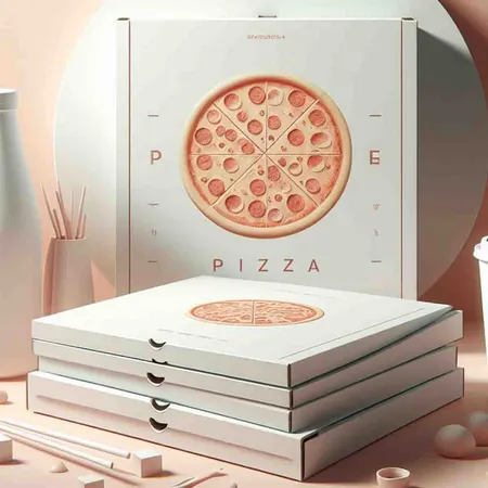
Pizza is the classic case. A full colour design with a photo of the pizza or a bold red brand colour wants white. The white pizza boxes for full colour print are coated for exactly that.
Which board shows grease marks more?
Both show grease, but differently. On kraft a grease spot turns the brown darker and slightly translucent. On white the spot goes grey and see-through, and against a white background it stands out more.
So white board tends to show grease sooner, and kraft hides it longer. For fried chicken, chips and pizza that matters, because the box is handed over before the grease has finished spreading.
Inside print changes this picture. Printing the inside of a white box in a dark colour hides marks on the surface the customer sees first when they open the lid. Kraft inside with a white outside does the same job for brands that want a clean exterior.
The answer on either board is a grease-resistant lining or coating, available on request. With a lining, the board colour stops being the deciding factor and you can choose on looks alone. The kraft pizza boxes with linings are often ordered that way.
How do four common combinations compare?
Most food boxes land on one of four set-ups. The table puts them side by side on print, grease and the kind of business each tends to suit.
Nothing here is a rule. Plenty of chip shops run white boxes and plenty of patisseries run kraft. The table just shows where each combination is easiest to live with.
| Combination | How the print looks | Grease | Tends to suit |
|---|---|---|---|
| Kraft, one dark colour | Warm, handmade, logo-led | Hides marks longest | Bakeries, coffee, burgers, street food |
| Kraft, two colours | Still warm, second colour adds a pattern | Hides marks well | Cafés, sandwich bars, markets |
| White, one or two colours | Clean and sharp, exact brand colours | Shows marks sooner, lining advised | Sushi, salads, bakeries with pale branding |
| White, full colour | Photographs and gradients print true | Shows marks sooner, lining advised | Pizza, chicken shops, brands with photo-led packaging |
What moves the quote more than the board colour?
People expect kraft to be cheaper. In practice the board colour on its own is a small part of the quote. The things below move it far more, and they apply to both boards.
If budget is the question, fix the box size and the print first and compare both boards on the same written quote. The answer is often closer than you think.
Board grade is the other quiet cost. A thicker board holds a heavier meal but uses more material, and that applies equally to kraft and white.
- Number of print colours: one colour costs less to set up than full colour
- Ink coverage: a small logo uses less ink than a full-bleed background
- Box size: a bigger blank uses more board whatever its colour
- Lining or coating: a grease-resistant finish adds to either board
- Corrugated or folding board: E flute and B flute cost more than single board
- Quantity: every order is quoted on its own quantity
Does a window change the choice?
A window cut-out shows the food, so the box surface matters less and the food matters more. That tends to favour kraft, because a plain brown frame around a bright cake or a glossy doughnut looks natural.
White board with a window suits pale food that would vanish against brown, such as macarons, meringues and white chocolate. The frame then disappears and the colour of the food carries the box.
On either board, keep the print away from the window edge by at least 5 mm so the cut does not clip the design. The window bakery boxes in kraft or white are cut after printing, so the window and the print line up.
How do you choose for your brand?
Work through these questions in order. Most kitchens reach an answer by the third one.
- Does your logo depend on white or a pale colour? If yes, lean to white board.
- Is the food fried, buttery or saucy? If yes, add a grease-resistant lining whichever board you choose.
- Do you want the box to look warm and simple or bright and exact? Warm is kraft, exact is white.
- Will the box carry a photograph or a gradient? If yes, white board.
- Will the box sit next to kraft bags and kraft cups? Matching the board across the range looks tidier.
- Ask for both boards on one written quote and look at the difference before deciding.
Can you mix kraft and white across a range?
Yes, and many brands do. A common split is kraft for hot savoury food and white for cakes and desserts, with the same logo on both. The logo keeps the range together even though the boards differ.
The trick is the ink. Choose one dark brand colour that prints well on both surfaces, so the kraft burger box and the white cake box look like one family. Pale accent colours can stay on the white items only.
Photograph both samples side by side before deciding, in the light your customers will see them in. A kraft box that looks warm under a shop spotlight can look dull in a dim hallway at the end of a delivery.
If you want one box style to work across the menu, start with a plain kraft meal box. With a lining and one colour print it covers more dishes than any other combination. The general purpose food boxes are usually ordered that way first.
How do you order a kraft or white sample proof?
Send us your logo and tell us the food the box carries. We make a free design proof showing your artwork on kraft and on white, so you can see the colour shift before choosing.
Both boards are priced from £0.25 per unit on one written quote, for the quantity you choose. Food-contact materials available on request. Approve the proof and the boxes are printed in 4 to 6 business days, with free tracked delivery across the UK taking 2 to 3 business days more.
If your artwork is still being drawn, the guide to artwork that prints well explains file set-up and safe zones for both boards.