Packaging guide
How to Design Printed Food Packaging That Prints Well
Artwork, colours, logo placement and file set-up for printed boxes, bags and paper.
What makes food packaging artwork different?
Packaging is not a flat poster. It folds, wraps around corners, gets stacked, and is seen from a metre away or across a street. A design that looks great on a screen can lose its logo in a fold.
Food packaging adds its own quirks. Kraft board darkens colours, greaseproof paper softens fine lines, and a small chip cup has very little room for text.
This guide covers the practical side: files, colours, placement and the checks to make on your proof. You do not need to be a designer. Our designers give free layout help on every order.
Which files should you send?
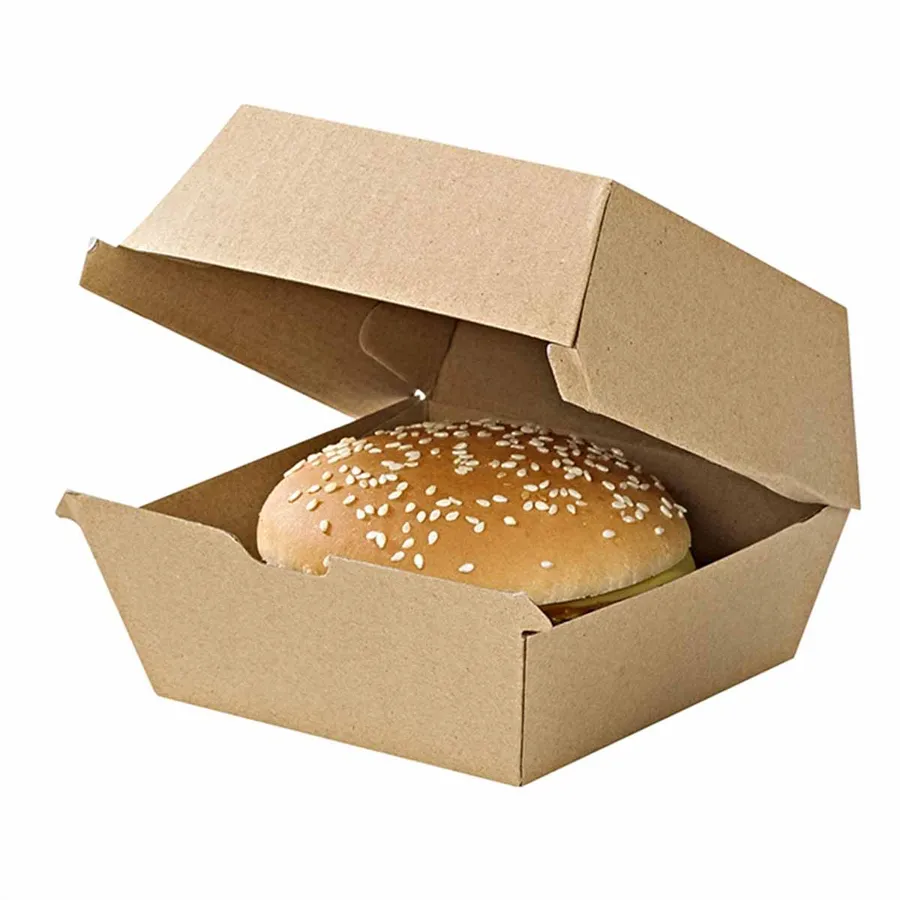
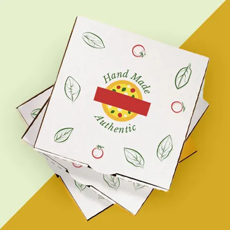
Vector files are best for logos. They scale to any size without going blurry, which matters when one logo goes on a 90 mm burger box and a 410 mm pizza lid.
PDF, AI and SVG files are usually vector. PNG and JPG files are made of pixels, so they work if they are large enough. Files up to 3 MB can be uploaded with your quote request.
Outline or embed any fonts in a PDF or AI file. If a font is missing on our side, the text swaps to a default typeface and the layout shifts.
If you only have a small logo from a website, send it anyway. We will tell you if it is too small to print cleanly and suggest what to do.
- Best: PDF, AI or SVG with fonts outlined
- Fine: PNG or JPG at 300 dpi at the printed size
- Avoid: screenshots, logos copied from social media
- Include: your brand colour references if you have them
How big should the logo and text be?
Size depends on the surface and on how far away people will see it. A pizza lid is read on a table, a burger bag in a hand, and a popcorn bucket across a cinema.
As a rule, keep body text at 8 pt or more and fine lines at 0.5 pt or thicker. On kraft board and corrugated board, go a little bolder again, as ink spreads slightly into the fibres.
The table gives starting points for logo width on common items.
| Item | Printable face, roughly | Logo width to aim for |
|---|---|---|
| Small burger box lid | 90 x 90 mm | 50 to 60 mm |
| Standard burger box lid | 115 x 115 mm | 60 to 80 mm |
| 12 inch pizza lid | 310 x 310 mm | 120 to 200 mm |
| Chip cup side | About 80 mm tall | 40 to 50 mm |
| Takeaway bag front | 220 x 250 mm | 100 to 150 mm |
| Greaseproof sheet repeat | 300 x 300 mm sheet | 30 to 50 mm per repeat |
How do colours change on kraft and white board?
White board shows colours close to how they look on screen, though never exactly. Screens glow and board does not, so bright on-screen colours often print slightly duller.
Kraft board is brown, and ink sits on top of that brown. Light colours almost vanish, and dark colours print darker still. Black, dark blue, deep red and white ink work best on kraft.
Greaseproof paper is thin and slightly translucent. Colours print softer and lighter, so a bold one or two colour design suits it best. You can see paper options in our printed greaseproof paper with your logo.
One colour, two colour or full colour?
One colour print is a single ink, usually black or a brand colour. It is the simplest and suits kraft board, paper bags and wraps.
Two colour print adds a second ink, which gives contrast and lets a logo keep its main colours. It is popular on pizza boxes and chip shop paper.
Full colour CMYK mixes four inks to make photos, gradients and detailed artwork. It looks best on white board. Plain, unprinted packaging is also available if you prefer a sticker or stamp.
Not sure which suits you? Upload your logo to Design Your Packaging on our site and see it on a box in different ink colours before you ask for a price.
Where should the logo go on a box?
Put the logo where people look. On a box with a lid, that is the lid. On a bag, it is the front panel. On a cup or bucket, it should repeat so it shows from any side.
Keep important elements away from fold lines and glue flaps. A logo split by a crease looks like a printing mistake even when it is not.
Inside print on boxes and trays is a good place for a second message. A short thank-you or your social handle under a lid is seen at the exact moment the customer opens their food. Our custom printed burger boxes are a common place to start.
What should go on food packaging besides the logo?
A logo tells people who made the food. A few extra details help them come back and order again.
Keep the list short. Every extra line competes with the logo, and on a small box there is not much room. Choose two or three of the items below and leave the rest off.
If you need allergen or product details on a pack, leave a clear panel for a label. Printing changing information directly on the box means reprinting every time the recipe changes.
- Your web address or ordering link
- A social media handle
- A short line about what makes your food different
- A clear panel for a date or flavour sticker
- A thank-you or message inside the lid
What are bleed and safe zones?
Bleed is extra artwork that runs past the cut line. When the board is cut, it moves slightly, and bleed stops a thin white edge appearing. Allow about 3 mm.
The safe zone is the area inside the cut where important text and logos sit. Keep them at least 5 mm in from any cut or fold.
We set up the dieline for your packaging and place your artwork on it. You do not need to draw the box shape yourself.
Corrugated board moves a little more than folding board during cutting. On pizza boxes and meal boxes, give text and logos a bit more space from the edge again.
How do you check a proof properly?
Your free design proof shows your artwork on the flat shape of the packaging, with folds and cut lines marked. It is your last chance to catch mistakes before printing.
Read every word slowly. Spelling errors in a business name or web address are the most common mistakes we see on approved proofs. Then check the layout, the folds and the colours.
Ask someone who did not design it to read the proof too. A fresh pair of eyes spots a missing letter far faster than the person who typed it.
- Check the spelling of every word, especially names and web addresses.
- Check that no logo or text crosses a fold or glue flap.
- Check the size of the smallest text against the guide above.
- Check which side is printed if you asked for inside print.
- Approve the proof only when everything is right.
How can one design work across many items?
Most food businesses want their burger box, chip cup, bag and paper to look like a set. The easiest way is a simple brand kit: one logo, one or two colours and one pattern.
The logo goes on boxes and bags. The pattern goes on paper and wraps, where a single logo would be hidden in the fold. The colours tie them together.
If you are starting a new street food or takeaway brand, our street food packaging checklist shows which items to design first.